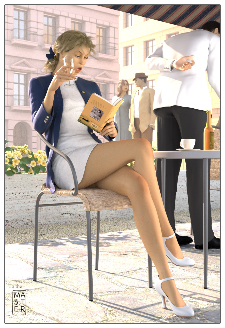
Changes:
•volumetric lighting, that’s decisively better
•waiter’s hand pose
•sculpted her dress a little, @michalis, please, be not too harsh… this is not real sculpting, just a fix,
•her face a bit changed, her jaw more opened, eyes more closed
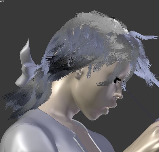
•blondy hair, but I don’t like so much
•added a small displacement to the chairs
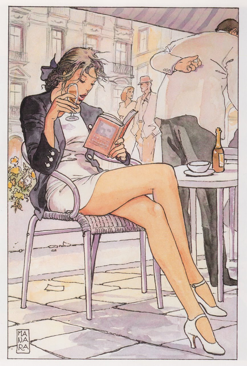
I’m still wondering whether a different approach could have been feasible and preferable, in terms of light, of level of realism etc.
The making of a 3d render matching a ‘non realistic’ illustration is an intruiging challenge to me.
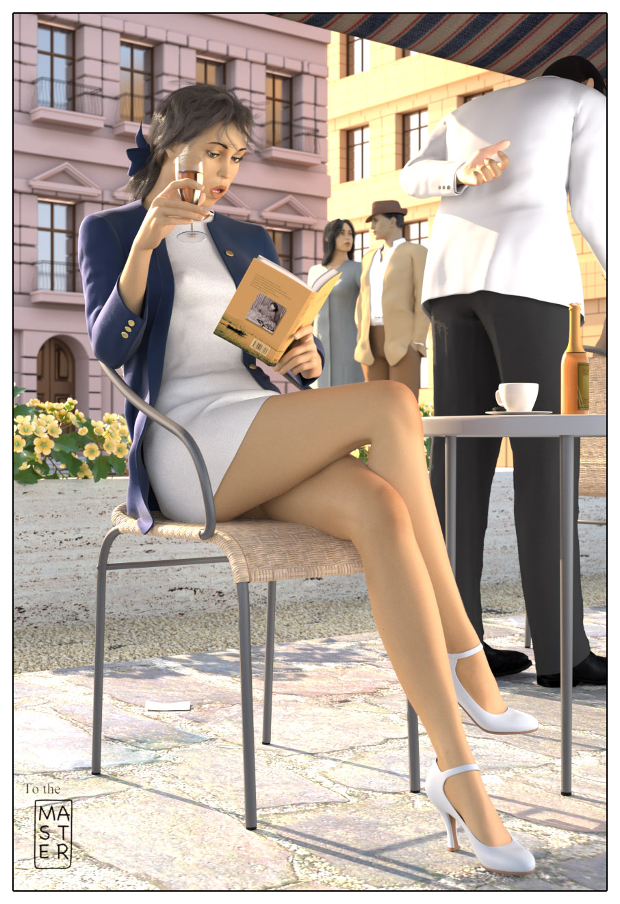
Thanks to all who commented here for their ever correct and useful suggestions, below is the former image which they were referring to.
Everything looks really really good but the head is not right. You should give the hair a blondy colour and fix the face. Maybe even make the head slightly bigger
Everything looks really really good but the head is not right. You should give the hair a blondy colour and fix the face. Maybe even make the head slightly bigger.
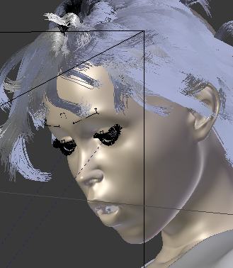
Critique on Girls face & waiters hand.
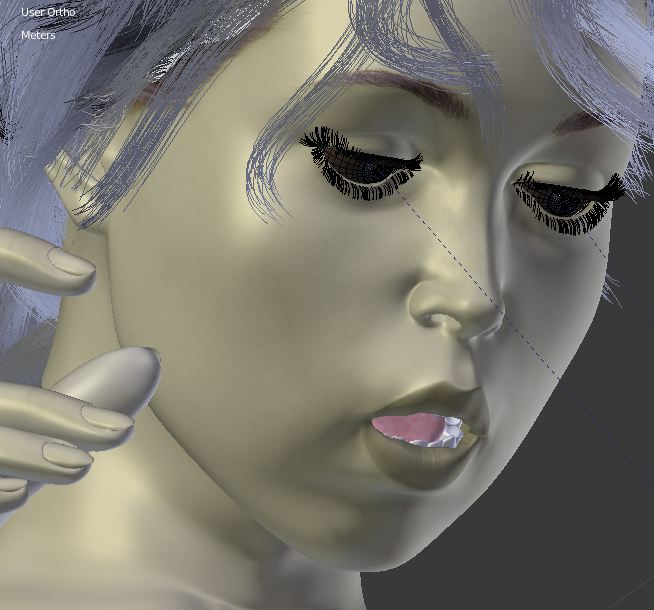
Face: Something about it say’s this is a mannequin or a doll. Maybe a touch of SSS needed? Or some slight variation of texture in her face? The rest of her body is spot on.
Waiters Hand: It is slighty un-natrual looking. I think it needs to be pulled slighty in towards his back a little more and rotated to the back of his hand is flush with his back like he is resting it there.
Yes, TheNewGuy, I partially agree about the hair, they are different and not blonde, I don’t know exactly why I didn’t attempted to make it blonde, and actually they lack volume.
About the head size I disagree, the forced perspective and the said above few volume of the hair give such impression, imo.
I think is fantastic, really one the best human made in blender,
however something is not quite right with her face, can you give us
a close up of the face so we can critique it better, is mostly there,
but something on the expression is making her not as engaging as it could be.
For the face, if I understand correctly she looks fake like a doll and I agree, though you must consider the subject, and the weird pose of her face, and my attempting to match an illustration, so, yes, she have to look fake someway, if you grab what I mean…
SSS, she’s full of, maybe a more varied texture would be fine, agree.
On a second look the eyebrows are much to distracting, making them a tiny bit less black might be a good idea,
if you see on the drawing they have a more angular shape, which make them more elegant and they are also
lighter so they are more subtle, like the rest of the image the face is almost only suggested and in the render this
subtleness is reduced because well, in 3d you can see it all, while when you draw you have more flexibility.
The golden rule for girls is less is more, Manara uses this rule to great effect, pulling this off
on 3d is a tad bit trickier but its perfectly possible.
I suggests seeing the work on Steven Stahlberg hes a fan of pinups too and I think you can see how he creates his faces
and perhaps apply some of his solutions to your work.
Renderluz, as you can see from the previous post eyebrows are from a texture, I used it on the basic figure I adapted for the goal via some shapekeys, though I did not changed this texture but I should have done, you are right.
I love Steven Stahlberg’s work and I admire him, but IIRC he has some methods I don’t agree, and seem to go against the right statement that less is more, though his work is wonderful.
Yes you know, in 3d it is not easy to skip details which you don’t need, above all in a reytracer, physically correct.
Thank you,
EDIT: I don’t disagree with critics about her face, I posted above some picts just for help to investigate further if you like…
Manara has used strong aerial perspective - the buildings in the background have quite low contrast compared with the foreground subject. If you could replicate this it would be good, or perhaps use DOF instead to achieve a similar effect. Otherwise the image is great. Perhaps modify the lighting on the woman’s face to give it more form and help it read better.
You are right about the ‘light’ of the scene, and sincerely that was one of the things that intrigued me in the image, and to make me try to make a sunny day with such light, and now I can say it almost impossible: in a clear day what is in the shadow is dark unless there is fog, and this can not be the case.
The fact is that, at the same time, I (intentionally) use an unbiased engine and without tricks of any kind: sunlight and skylight, period.
After I realized that it was absolutely needed a diffuse light to enlighten her and i added a large plane, like a reflective surface used by photographers, the lightest possible, but in the original scene the sun comes from back, she should be in full shadow. So the mine was a compromize, probably bad I don’t know.
In a real scene like this subjects in the shadow are lit by bounced light form the environment, such as light bouncig off the pavement. A good GI solution woujld be needed to get it right. Also aerial perspective is caused by haze so if yuo could introduce some mist in the scene no need for tricks in the lighting.
In my opinion, the thing that makes the girl look a bit off is partly the face where you need to move the mouth a bit inwards. If you look at the reference, her “Jawline” in bulked inwards. Though in your render the same line bulkes outwards.
The second thing is the skin color which in my opinion should have a bit more red in it to make it a little bit more pink.
Would absolutely love to see a rerender!!
EDIT: I should say that the anatomy of the girl’s face looks absolutely correct, it is just in this case that it might have to be slightly modified
Crazychristina,
I don’t understand what do you mean with GI solution, I have a raytracer, I have the sun, I have the sky, the environment, and a large panel enlightening the shadows, what else in a real scene?
As for the haze, at start I tried it but then I realized that a kind of haze able to actually enlighten the scene would be real fog, not the best for a sunny italian day.
Actually in a clear day the shadows are more dark and contrasted.
You should not disregard the freedom of illustration, in opposite to the rigor of a ‘phisical’ engine.
Hi john_9998, thank you for you comments.
I agree with bot the suggestions, for the former, since I received many useful comments about her face, particularly from Renderluz, I will study them and I will try and follow them; for the skin color, I’m working on it, but it less simple that it seems.
What do you mean with love to see a rerender, if you mean a corrected one, i will do as soon I have the chance.