
As part of an investigation project at work, we had to create a number of graphs. Of course our first idea was using Excel; but it turns out that in a lot of scenarios it’s ambiguous, time consuming and sometimes outright frustrating. So we ended up doing it with Gnuplot, which provided a much better experience.
This article is not meant to give extended coverage of course; there are many FAQs and other documents available online for that (a small collection is given at the end of the article). It’s meant to cover basic usage and some common scenarios, namely:
- How to download and install
- How to plot a simple function
- How to plot data points from a file
- How to plot multiple functions and/or data points
- How to setup the plot (axes etc.)
- How to fill the area between functions
- How to export the plot for MS Office
- How to plot using batch files
- Links and FAQs
Gnuplot is a really powerful tool. This article won’t cover many things, like 3D plots, polar coordinates, binary data, financial-style graphs and others; take a look at the demo library for that (link given at the end).
How to download and install
Download is provided from Sourcefourge. Go to http://www.gnuplot.info/download.html and get the current version.
After downloading, installation is pretty easy and straightforward. Just click “next” in every step and you’ll be ok.
After installation, start Gnuplot from the desktop icon. You’ll get a command prompt (gnuplot>).
How to plot a simple function
A major problem with MS Excel is that you cannot create a graph for a function; you have to create the data in cells, using a formula. And of course, the values will not be continuous but discrete.
So let’s say you want to make a graph of a function f(x)=x^2+10/x, for values of x between -10 and 10. Enter these commands to the command prompt, pressing ENTER after each line (lines that begin with # are comments):
# setup the x axis range
set xrange [-10:10]
# plot our function
f(x)=x**2+10/x
plot f(x)
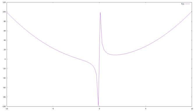
To change the line color, the easiest way is to use one of the available linestyles:
plot f(x) linestyle 3
In order to see the readily available linestyles, just enter:
test
How to plot data points from a file
For our example, we have two text tab-separated files, c:\temp\out1.txt and c:\temp\out2.txt, that look like this:
out1.txt

1	30
2	30
3	30
4	30
5	30
10	200
20	200
30	200
40	200
50	200
100	500
200	500
300	500
400	500
500	500
900	500
out2.txt

1	TS	5.3	3.5
2	TS	4.2	7.4
3	TS	6.1	7.3
4	RS	0.9	2.1
5	RS	1.2	2.2
6	RS	0.8	1.9
7	TS	4.9	3.1
8	TS	5.7	2.8
9	TS	4.4	3.4
The first has just two columns, x and y. The second has four columns: the second is labels on x, the third and fourth are measurement values (y) and the first an incremental number (for gnuplot to know which comes first, second etc.)
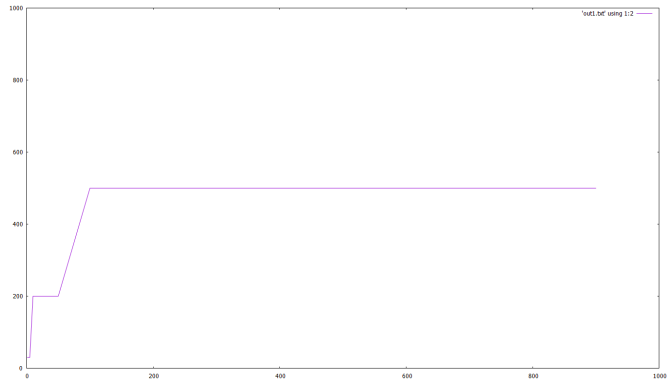
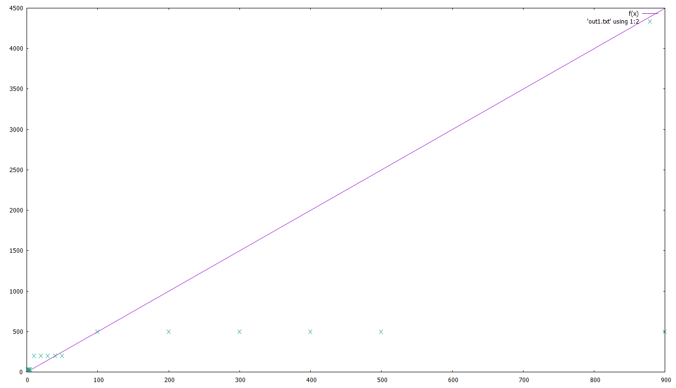
Let’s plot the first one:
# make sure we're in the correct dir
cd 'c:\temp\gnuplot'
set xrange [0:1000]
set yrange [0:1000]
plot 'out1.txt' using 1:2
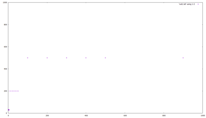
Note the 1:2 here. This tells gnuplot that the 1st column of the file will be used for x and the 2nd for y.
If you want to connect the points, the last line would be:
plot 'out1.txt' using 1:2 with lines
If instead of simply connecting the points you would need to do a ‘best fit’ with a given function, say g(x)=a*x+c :
g(x)=a*x+c
fit g(x) 'out1.txt' using 1:2 via a,c
# here you get a list of the calculations gnuplot is doing, the parameters used and the standard error
plot 'out1.txt' using 1:2, g(x)
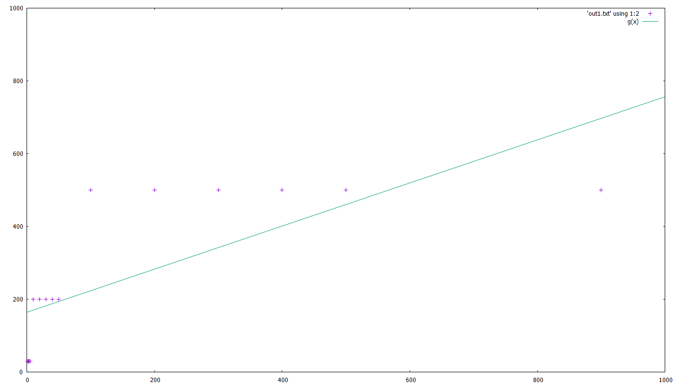
Of course, that’s not a very accurate fit, but that’s not our point here 🙂
Let’s now plot the second file. Our goal here is to create a bar chart:
cd 'c:\temp\gnuplot'
# 'set autoscale' automatically sets ranges for x,y
set autoscale
set boxwidth 0.5
set style fill solid
plot 'out2.txt' using 1:3:xtic(2) with boxes
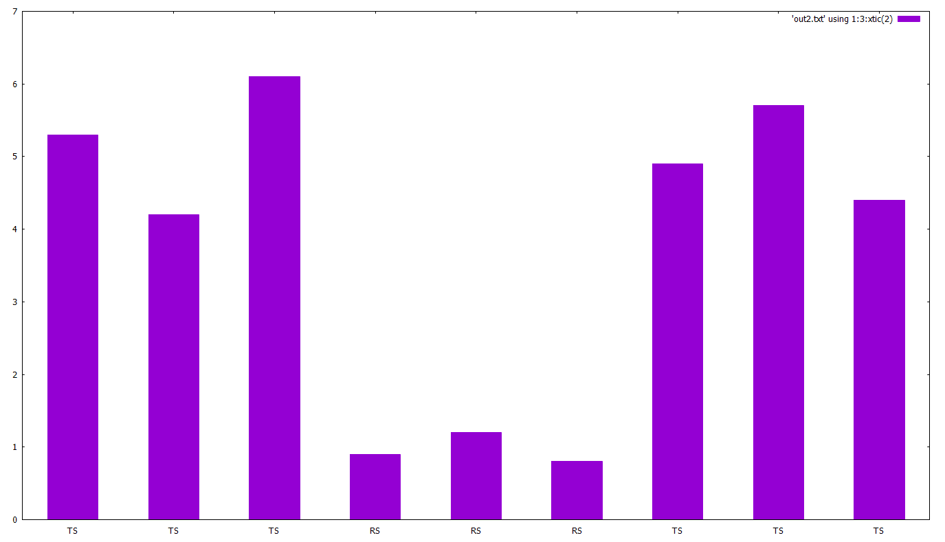
Note the 1:3:xtic(2). This tells gnuplot that the 1st column is ot be used for x, the 3rd for y and the 2nd (xtic(2)) for x-axis labels.
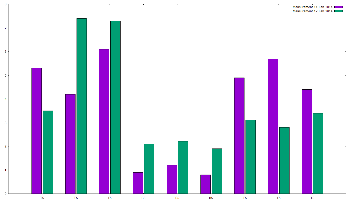
Now let’s try to plot two data series in the same bar chart:
cd 'c:\temp\gnuplot'
set style data histogram
set style histogram cluster gap 1
set style fill solid border -1
set boxwidth 0.9p
plot 'out2.txt' using 3:xtic(2) title 'Measurement 14-Feb-2014', 'out2.txt' using 4:xtic(2) title 'Measurement 17-Feb-2014'
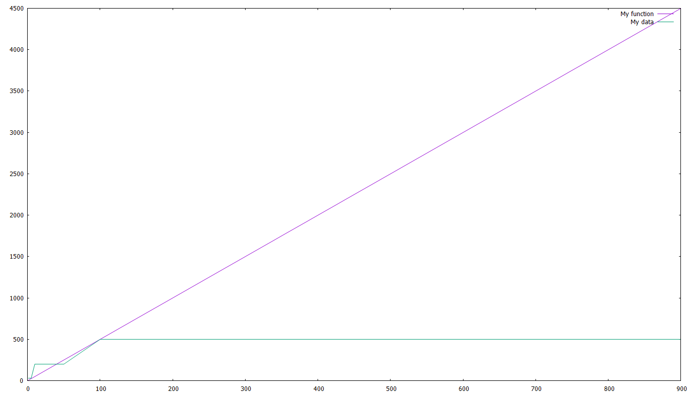
How to plot multiple functions and/or data points
Actually we did that already in the example with the fit and bar examples. We just have to give multiple functions/files and separate them with a comma. As an example:
cd 'c:\temp\gnuplot'
a=5
f(x)=a*x
plot f(x), 'out1.txt' using 1:2
Let’s add a line and a legend, shall we ? The last line will become:
plot f(x) title 'My function', 'out1.txt' using 1:2 with line title 'My data'
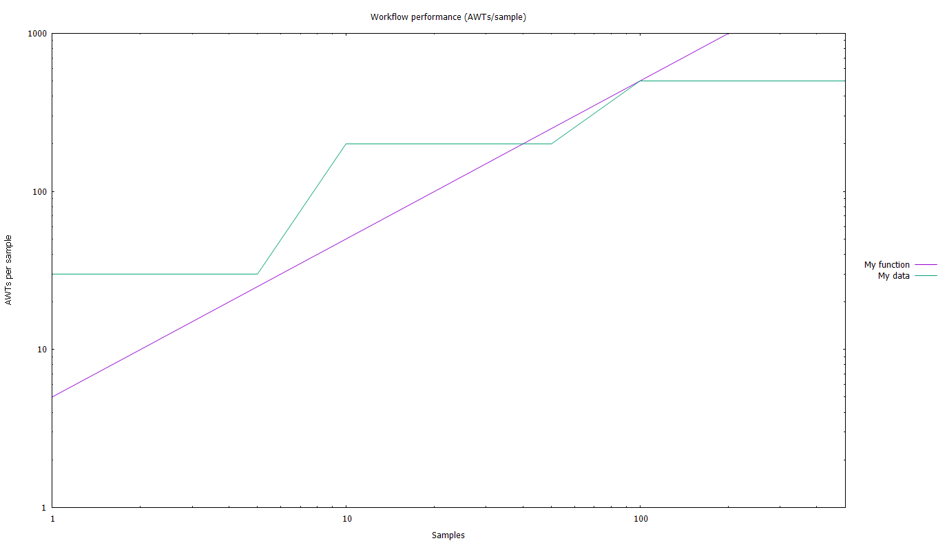
How to setup the plot (axes etc.)
Let’s see an (almost) all-inclusive example:
# Chart title
set title 'Workflow performance (AWTs/sample)'
# Get the legend out of the chart
set key outside
# place the legend
# here you can use 'left', 'right', 'center' and 'top', 'bottom', 'cent'
set key right cent
# Setup the axes range using, e.g.
# From-to
set xrange [1:500]
set yrange [1:1000]
# logarithmic
set logscale x
set logscale y
# axes titles
set xlabel 'Samples'
set ylabel 'AWTs per sample'
# let's see what we've done
replot
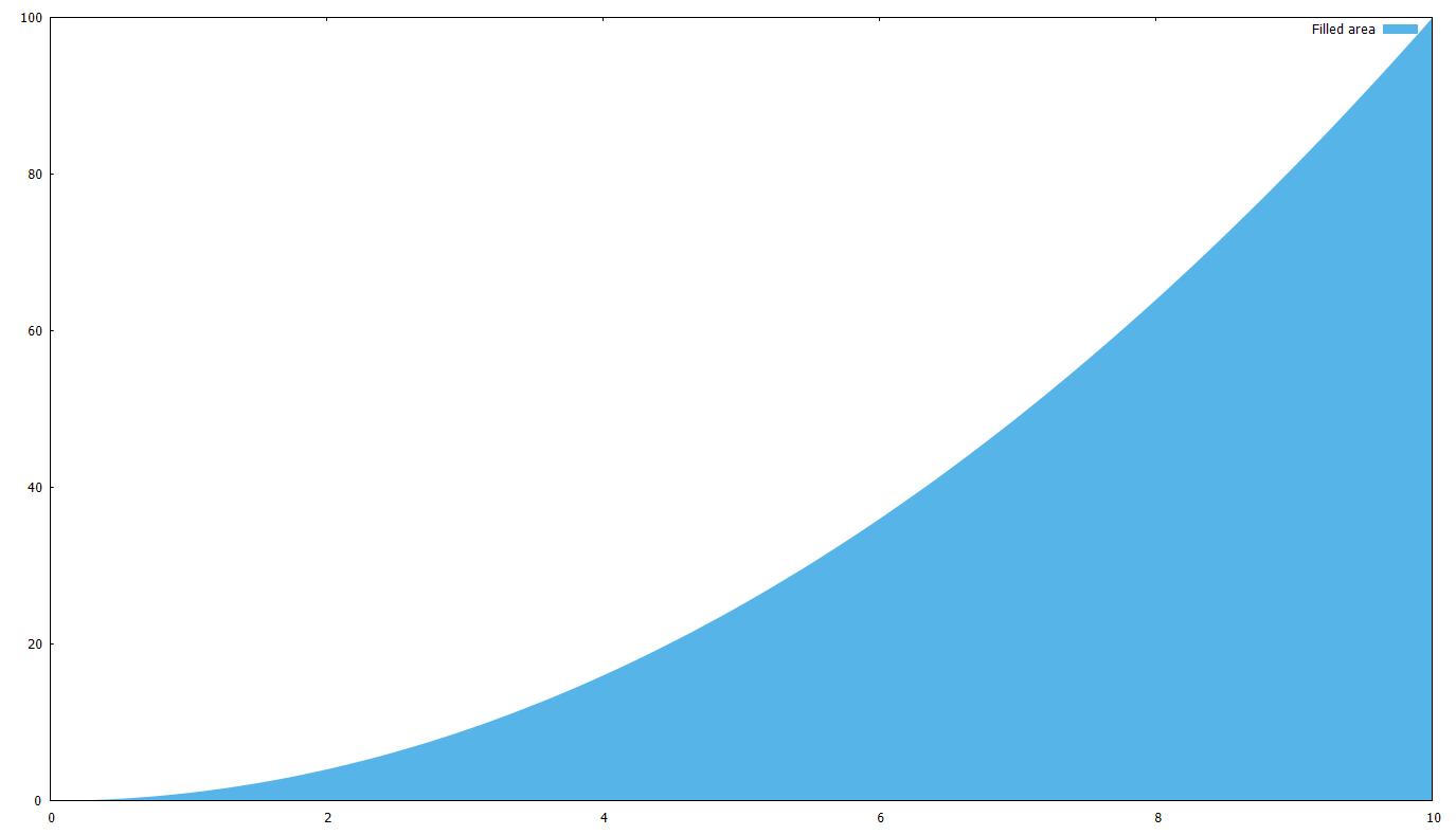
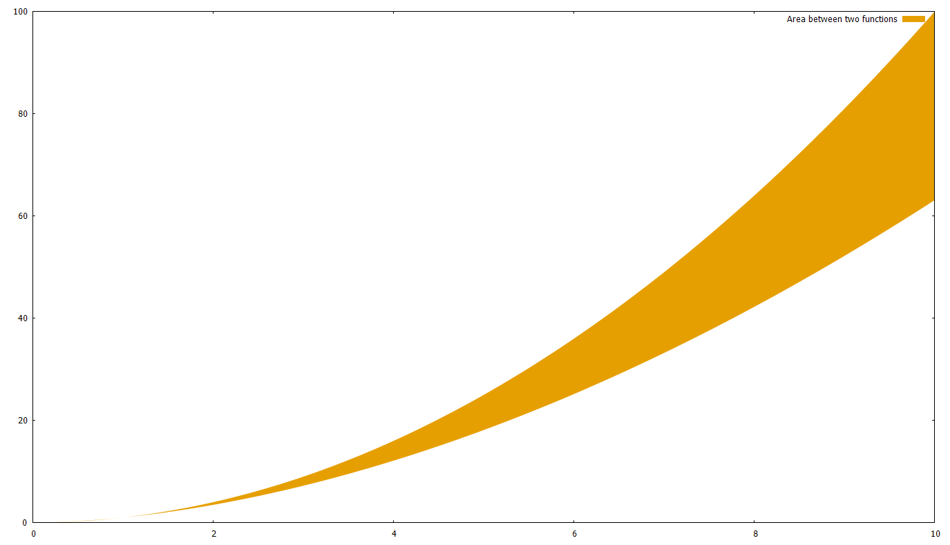
How to fill the area between functions
What if you want to fill the area below a curve, or between two curves ?
First, let’s fill the area between a curve f(x)=x^2 and the x axis:
set xrange [0:10]
# c(x) is the same as the x axis
c(x)=0
f(x)=x**2
# '+' is the pseudofile, you can read about it in the documentation
plot '+' using 1:(c($1)):(f($1)) with filledcurves closed linestyle 3 title 'Filled area'
After this, it should be obvious how you can fill the area between two curves; just use a function instead of c(x)=0. Let’s say we use g(x)=x^1.8
set xrange [0:10]
g(x)=x**1.8
f(x)=x**2
plot '+' using 1:(g($1)):(f($1)) with filledcurves closed linestyle 4 title 'Area between two functions'
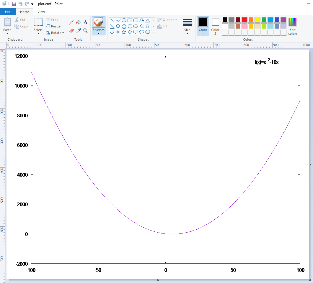
How to export the plot for MS Office
Although of course you can do a printscreen, the best format to use with Word, Powerpoint etc. is the Enhanced Metafile Format (.emf). The best thing about it is that it’s scalable. Surprisingly, if you have a .emf image and preview it (Windows uses Paint by default) it seems awful; but if you insert it in Word it looks great.
So, in order to create a plot and get it as an .emf you need to do something like this:
# output directory and file name
cd 'c:\temp\gnuplot'
set terminal emf enhanced
set output 'plot.emf'
# create the plot
set xrange [-100:100]
f(x)=x**2-10*x
plot f(x) title 'f(x)=x^2-10x'
# because of 'set output' above, plot creates
# the file on disk instead of showing it on the screen
# NOTE: until you 'unset output', the plot file (.emf, .pdf, whatever)
# is locked and cannot be accessed
unset output
# normally you need to return the plot output to the screen
set terminal wxt
How to plot using batch files
Creating a batch file is useful in several scenarios. For example, you might have a data file (like out1.txt above) which changes every day; and every day you need to create the same graph, but with the fresh data.
So in order to do this, just write all gnuplot commands to a text file and execute it with gnuplot.exe. See the example below (the backslash means that the line is continued):
# Save as 'C:\temp\dailychart.plt'
cd 'c:\temp\gnuplot'
set terminal pdf enhanced
set output "plot.pdf"
f(x) = 980/x
c(x) = 650
plot \
f(x) title '980 limit' linestyle 1, \
c(x) title '2 sec limit' linestyle 2, \
'out1.txt' using 1:2 title 'External data' linestyle 3, \
'out2.txt' using 1:3 title 'External data 2' linestyle 4
unset output
quit
The .plt extension is the gnuplot default, but you can name the file anything (e.g. .txt). Now open a Windows command prompt and type:
"C:\Program Files (x86)\gnuplot\bin\gnuplot.exe" c:\temp\dailychart.plt
Links and FAQs
By far the best resource is the demo scripts library. Here you can find almost anything and adapt it for your scenario.
Demo scripts for gnuplot (with images of output)
http://www.gnuplot.info/demo/
gnuplot Quick Reference (.pdf)
http://www.gnuplot.info/docs_4.0/gpcard.pdf
Plotting functions
http://www.gnuplotting.org/plotting-functions/
A Brief Manual and Tutorial
http://people.duke.edu/~hpgavin/gnuplot.html
gnuplot FAQ
http://www.gnuplot.info/faq/faq.html
Official gnuplot documentation
http://www.gnuplot.info/documentation.html

gnuplot is quick and easy. this is a nice little turorial. thanks.
Thank you very very much for your explanations, they help me understand plotting in Gnuplot much better.
bookmarked!!, I like your blog!
Everything is very open with a very clear explanation of the challenges. It was really informative. Your site is very helpful. Thanks for sharing!