Simon de Colines (1480-1546) and his contributions to the modernization of book design was underappreciated — until master typographer and historian Kay Amert conducted research on the Parisian printer who experimented with dynamic page layouts and pioneered the use of italic types in France during the Renaissance. For the typography buff, historian or lover, this work sheds fresh light on typography from the Renaissance that shaped publishing as we know it today.
![]() Simon de Colines (1480-1546) and his contributions to the modernization of book design was underappreciated — until master typographer and historian Kay Amert conducted research on the Parisian printer who experimented with dynamic page layouts and pioneered the use of italic types in France during the Renaissance.
Simon de Colines (1480-1546) and his contributions to the modernization of book design was underappreciated — until master typographer and historian Kay Amert conducted research on the Parisian printer who experimented with dynamic page layouts and pioneered the use of italic types in France during the Renaissance.
Although Amert died in 2008 and left her published and unpublished writings unfinished, Robert Bringhurst has brought them all together in The Scythe and the Rabbit: Simon de Colines and the Culture of the Book in Renaissance Paris, published by Cary Graphic Arts Press at Rochester Institute of Technology.
 Simon de Colines was one of the greatest typographers, printers and publishers of the Renaissance. He has nevertheless been unfairly neglected. Apart from a pair of scholarly bibliographies, published a century apart, this is the first book-length study of his work.
As Robert Bringhurst writes in his introduction to this volume,
Colines as much as anyone built the semiotic structure of the book as we now know it, with its chapter headings and subheads, page numbers and running heads, tables of contents, indices, and source notes. He also cut lucid and beautiful type at a crucial moment: when the Latin and Greek alphabets were still engaged in their historic metamorphosis from manuscript to metal….
But Colines was a great publisher as well as a fine technician.
This book is about the high-art of typography and publishing, as it unfolded in Redaissance Europe. It sets the stage for the expansion of the art all over the world! For the true lover of typography, or this book fills in all those gaps left behind undiscovered.
![]()
 The Scythe and the Rabbit: Simon de Colines and the Culture of the Book in Renaissance Paris
Kay Amert (Author), Robert Bringhurst (Editor)![]() View sample spread #1
View sample spread #1![]() View sample spread #2
View sample spread #2
Publisher: RIT Cary Graphic Arts Press (November, 2012) ~ Paperback: 292 pages ~ Language: English
Kay Amert was a master typographer, a master printer, and a meticulous, insightful typographic historian, particularly knowledgeable in the field of French Renaissance printing and publishing. She was the director of the Typography Laboratory at the University of Iowa. She died in 2008, leaving her work unfinished. Her published and unpublished writings on de Colines have been carefully edited by Robert Bringhurst.
Send us your best
We love to hear readers’ reactions to books, and favorite reading. If you create your own ‘book’ please send us samples, or photos and tell us a little about your story! DTG readers will enjoy every shot!
And, thanks for reading
![]()
Don’t forget … we encourage you to share your discoveries with other readers. Just send and email, contribute your own article, join the Design Cafe forums, or follow DTG on Facebook!
TABLE OF CONTENTS :
- Introduction
- Parisian Printing in the Early Sixteenth Century: Establishing an Internation Idiom
- Origins of the French Old-Style: The Roman and Italic Types of Simon de Colines
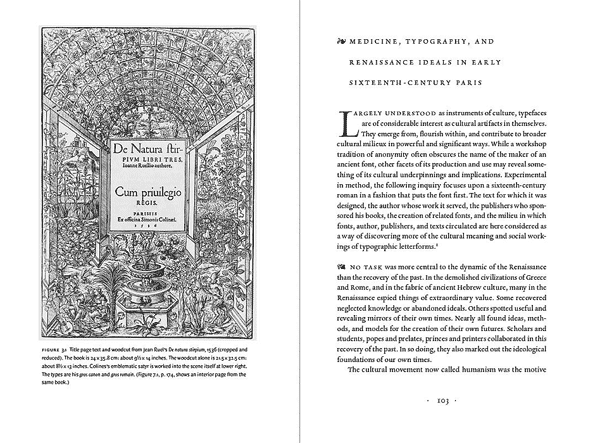
- Medicine, Typography, and Renaissance Ideals in Early Sixteenth-Century Paris
- Sculpture under the Microscope: A Closer Look at Some Sixteenth-Century Letterforms
- Duet for the Design of Letters: The Work of Simon de Colines and Geofroy Tory
- The Humanization of a Medieval Form: Geofroy Tory’s and Simon de Coline’s Books of Hours
- The Phenomenon of the Gros Canon: The Birth of Roman Display Type in Renaissance Paris
- The Intertwining Strengths of Simon de Colines and His Stepson Robert Estienne
- The Aldine Hypothesis: Appraising and Reviving Early Italian and French Printing Types
- Afterword
- Appendix I: Provisional Census of Types Cut by Simon de Colines
- Apendix II: Outline of the Typographic Dialogue between Colines and Robert Estienne
For more than two decades, U.S. News & World Report has ranked RIT among the nation’s leading comprehensive universities. RIT is featured in The Princeton Review’s 2013 edition of The Best 377 Colleges as well as its Guide to 322 Green Colleges. The Fiske Guide to Colleges 2013 names RIT as a “Best Buy,” and The Chronicle of Higher Education recognizes RIT among the “Great Colleges to Work For 2012.” For RIT news, photos and videos, go to .
www.rit.edu/news